
Animated commercials: what is their advantage over traditional advertising spots?
Spis treści:

Visual appeal and creative freedom.
In the dynamic world of marketing, advertising plays a vital role in capturing attention and promoting products or services. Recent years have brought a revolution to this field, driven by technological advancements that have provided tools for creating entirely new formats. In today’s saturated online landscape, the ability to grab a viewer's attention has become both a critical aspect and a significant challenge.
Animated commercials stand out not only for their dynamic nature but also for their visual appeal and limitless creativity. Creative studios, such as elomate®, ensure that these elements are expertly integrated into every spot. Their work is essential to how audiences perceive and engage with animated advertising.
Animations allow for experimentation with innovative graphic designs that capture attention from the very first second. Specialists in creative studios possess the expertise and tools to build unique visual worlds, enabling brands to break free from conventional advertising patterns. Furthermore, the use of color and motion in animation significantly enhances visual memory. By leveraging a rich color palette and dynamic transitions, animation studios effectively command attention—a crucial factor in the competitive race for consumer focus that traditional commercials simply cannot match.
Fast and lasting advertising impact.
Specialists at creative studios like elomate®understand that in the fast-paced online world, where attention spans are short, animations offer an effective way to deliver key messages quickly. When creating animated ads, it is essential to use fluid transitions to condense content into its most important elements, stripping away unnecessary details. This efficiency in communication is a key competitive advantage, allowing an ad to hit its mark quickly and leave a lasting impression.
Moreover, graphic visualizations created in an animation studio can make abstract concepts much easier to understand, making information more accessible to diverse target audiences. Animated characters have an extraordinary power to evoke emotion. The sounds, expressions, and gestures of characters designed by a professional creative studio can build an emotional bond with the viewer, which in turn influences how the brand and the entire advertising message are perceived.
In summary, animated commercials offer a vast array of possibilities unavailable to traditional spots. The animation studio elomate® specializes in these types of productions, which are taking the media by storm. Step into the world of advertising with the creative studio elomate® and see what we can do for you.
podobne artykuły na naszym blogu
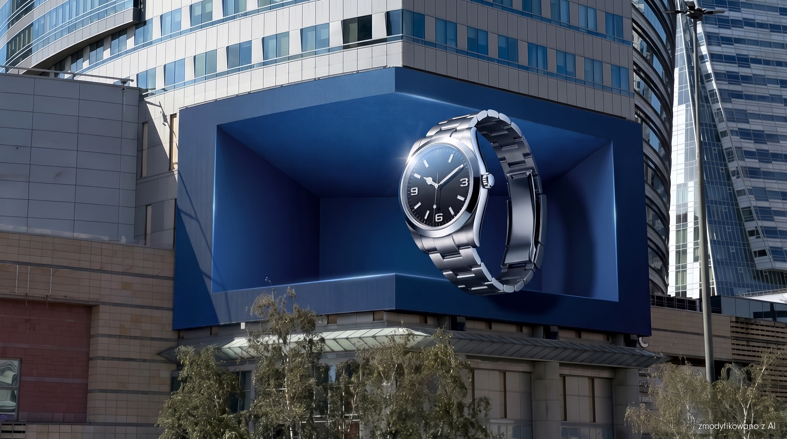

What is 3D anamorphic advertising?
Anamorphic advertising uses a specially designed perspective to create an illusion of depth on a flat screen. The viewer does not need glasses or any additional equipment, which is why the format is often referred to as naked-eye 3D. The screen can create the impression of a window leading into a much larger space. An object can appear to be deep inside a building or, conversely, cross the boundary of the screen and reach out toward the viewer. This is not a hologram or a real three-dimensional image. The entire effect is based on an optical illusion. The perspective lines, object scale, and virtual camera settings are prepared so that the image looks spatial from a specific viewing point. That is why the term "3D DOOH advertising" is significant here. It is not just about creating an animation in 3D software; it is about designing it for a specific digital display in a real-world space.
Why isn't standard 3D animation enough?
An animation might look great on a monitor, a website, or a classic advertising screen while completely failing to utilize the potential of an anamorphic display. The reason is simple: such a screen must be taken into account during the design phase. Its proportions, the number of surfaces, corners, the image-joining point, and the spot from which viewers most often look at the ad all matter. The virtual camera must correspond to this perspective. This sometimes leads to a situation where the image viewed directly in the software may look heavily distorted. Only after it is displayed on the correct screen and viewed from the right spot does everything come together into a single space. That is why a finished spot cannot simply be "converted to anamorphic." The display should be part of the creative thinking process from the very beginning.
First the screen. Then the idea.
Producing an anamorphic ad does not start with modeling a product or creating flashy movement. First, you must understand the location where the material will be viewed. We analyze the screen's construction, its proportions, and the main viewing point. The surroundings are also important: the building, the street, the direction of pedestrian traffic, or the distance from the display. All of this can influence the concept itself. A screen corner does not have to be a problem we try to hide; it can become part of the set design. Multiple surfaces can create a single digital interior. A product can utilize the scale of the facade or interact with the architecture. The 3D effect should stem from the idea, not be tacked onto it. If the only concept is "let's make something come out of the screen," it is easy to end up with a demonstration of technology rather than a good advertisement.
The space should work for the product and the brand
The most interesting anamorphic projects are not those where the most things fly toward the viewer. It is much more important why we are using the space. A product can cross the screen boundary to emphasize its form more strongly. A digital interior can reveal its construction. A change in scale can turn a small object into the main protagonist of an entire facade. There are many possibilities, but the technology should support the message. This is especially important now, as these types of projects will become more frequent. The moment an object "comes out of the screen" will eventually stop being a sufficient differentiator. A viewer might remember a flashy animation while completely forgetting which brand was behind it. Technology attracts attention. The idea determines what the viewer remembers from that attention.
What does the production of an anamorphic ad look like?
After defining the display and the creative direction, the actual 3D scene is created. Depending on the project, we prepare models, materials, lighting, the product or character's environment, and the animation itself. One of the most important elements is the camera. Its position influences whether the created space will look natural, whether the product will maintain the correct scale, and whether the individual screen surfaces will create one cohesive image. Only in such an environment do we design the movement. Finally, the animation is rendered according to the parameters of the specific display and prepared in the formats required by its operator. Resolution, frame rate, codec, or spot length can vary depending on the screen, which is why production should always be based on the current specification. This is one of the things that strongly distinguishes this format from creating a universal film that is later adapted to several aspect ratios.
3D DOOH advertising is also emerging in Poland
A great example of this format's development is the Warsaw STAGE at Złote Tarasy in Warsaw. It is a three-sided LED screen with a surface area exceeding 800 m², designed to allow for creative content that spans multiple connected surfaces. Its structure perfectly illustrates why anamorphic DOOH requires a different approach to content creation. The footage can flow between walls, utilize the building's corner, and create the illusion of a single, vast space existing behind the screen. However, Warsaw STAGE is just one example. Every screen has different geometry, proportions, and viewing conditions, which is why the same creative should not be mindlessly transferred between different displays.
3D DOOH advertising - see how we design creatives for specific screens →
Why do 3D ads have the potential to go beyond the screen itself?
An interesting feature of this format is that a campaign can operate in two spaces simultaneously. The first is, of course, the broadcast location. The large screen and unique spatial effect are designed to capture the attention of people in the immediate vicinity.
But then, the second space comes into play: the internet. People record these unique displays with their phones, post them on social media, and share them further. Campaign footage can also appear in the brand's own communications, industry media, or PR activities. You cannot engineer a viral hit or guarantee a specific number of organic shares. However, you can increase the chances that the creative will be interesting enough for viewers to want to record it. That is why it is crucial that the key moment is clearly visible in a phone recording and that the brand remains recognizable even without knowing the full context of the campaign. A well-designed DOOH campaign can thus start working far beyond the location where the screen is installed.
Anamorphic 3D advertising vs. FOOH - what is the difference?
These formats are often confused because both can feature spectacular events that seemingly take place in real space. However, the difference is fundamental. In 3D DOOH, the advertisement is actually broadcast on a physical screen. The creative must therefore be prepared for a specific display, its geometry, and the viewing angle. A passerby can actually see it on-site. FOOH, or Fake Out of Home, is primarily video content. It can show a massive product on a building, an impossible installation, or an event that never actually took place. In 3D DOOH, we design an illusion for the screen and the viewer standing in front of it. In FOOH, we design an illusion primarily for the camera and the viewer watching the finished video.
See how we create FOOH animations →
When does anamorphic advertising make sense?
Not every campaign needs a naked-eye 3D effect. If you need to convey a lot of text, a complex offer, or several pieces of information of equal importance, a classic DOOH animation might simply be a better solution. 3D DOOH is particularly interesting when the product itself allows for playing with form, material, scale, or space. It also fits well with product launches and brand campaigns where a strong first impression is key. It is also worth considering this format when the campaign has the potential to live on in social media. You have to ask yourself: "Will using the space allow us to say something more interesting about this product?" If the answer is "no," a well-designed DOOH screen animation might work better.
What do you need to know before starting production?
The most important thing, of course, is the campaign goal and the idea itself. The studio needs to know what we are communicating, who we are talking to, and what the audience should remember. Next, you need the specific media format and its current specifications. The sooner we know the screen, its parameters, and the broadcast date, the sooner we can treat its structure as an element of the creative process. For products, you may also need 3D models, technical documentation, photos, dimensions, or information about materials. Not having a ready-made model is not a problem—you just need to include its preparation in the production process. It is also worth separating two roles. The operator is responsible for the surface and the broadcast. The animation studio is responsible for the concept, design, animation, and preparation of the final content in accordance with the media requirements.
Increasingly interesting screens require increasingly better content
The development of 3D DOOH shows a larger shift taking place in outdoor advertising. A screen is less and less likely to be treated solely as another rectangular format to which we adapt a finished spot. Its scale, proportions, location, or construction can become part of the idea itself. Anamorphic 3D is one of the most spectacular examples of this approach. This does not mean that every brand should now use naked-eye 3D. It does mean, however, that the capabilities of media are developing very quickly, and the way content is designed should evolve along with them. Because a large screen in itself does not create a good advertisement. An idea that can leverage its capabilities does.
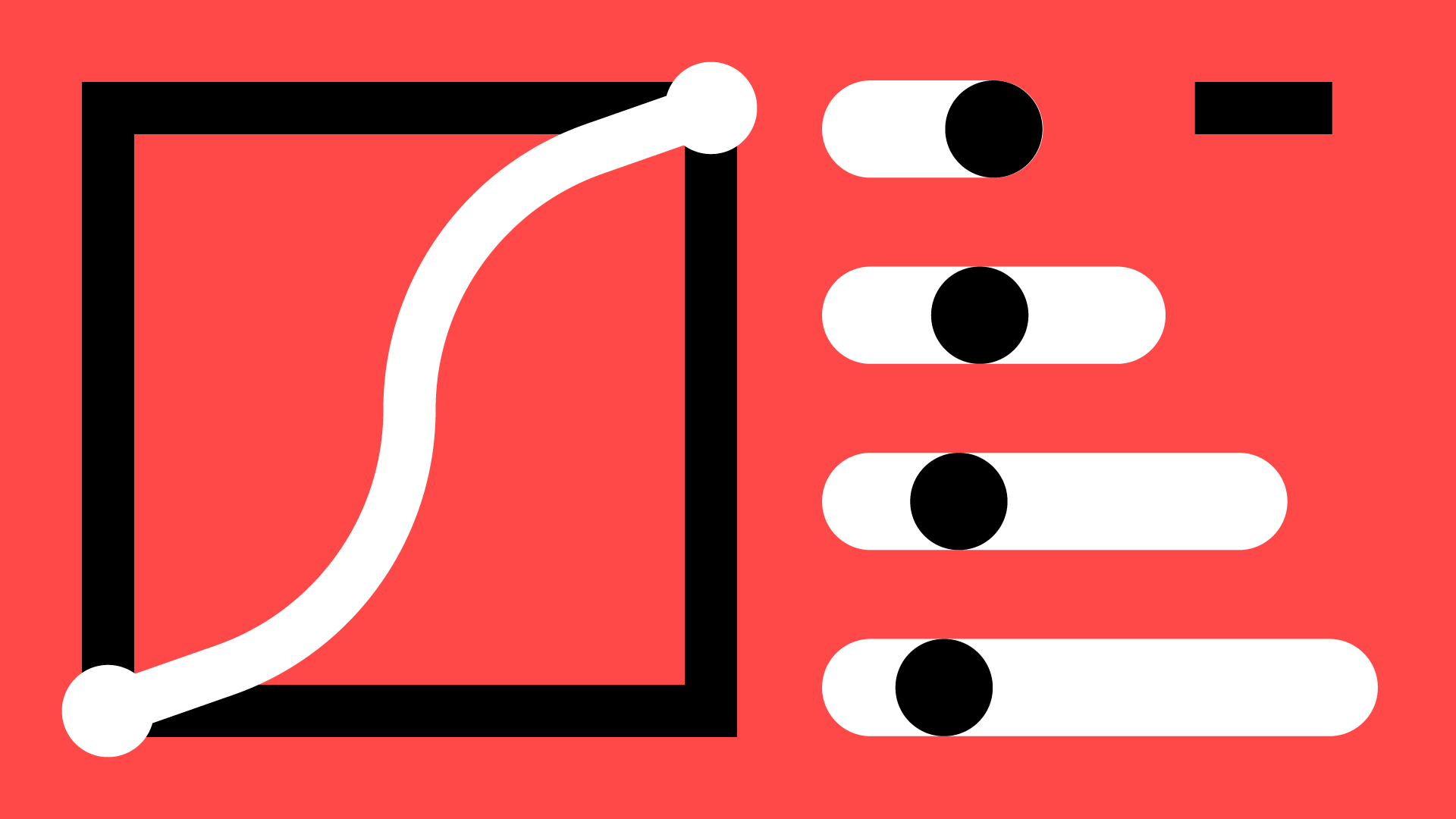
What is Motion Branding in the era of ubiquitous screens?
For many years, animation was treated primarily as an aesthetic add-on. It was meant to grab attention for a moment and then disappear among dozens of other messages. Today, with brands present on screens almost everywhere—from billboards and menu boards to websites and smartphones—that approach is no longer enough.
Motion Branding changes the way we think about animation. It stops being an add-on and becomes a full-fledged element of a brand's visual identity—just as important as the logo, typography, layout, or colors. Motion begins to build brand recognition rather than just enhancing individual assets.
For this to work, animation shouldn't be created by chance or depend on the style of a specific motion designer. It should stem from the brand's character. That is why a Motion Design System is created—a set of rules that define how a brand moves on screen. The speed of animation, the smoothness of transitions, the dynamics, and the way elements react are all designed to reflect the brand's personality. A stable financial brand will move differently than a modern retail brand that wants to be associated with energy and speed.
The lack of such a system means that every subsequent animation looks a bit different. As a result, communication becomes inconsistent, and the brand loses its recognizability. The audience may not notice this consciously, but subconsciously, they perceive the brand as less professional and less consistent.
That is why Motion Branding is not about creating individual animations. It is about designing a consistent language of motion that can be used across all materials—from social media and websites to advertising campaigns and Digital Signage screens. Thanks to this, every new animation strengthens the brand instead of building it from scratch.
An elomate fun fact: A well-designed motion branding system allows audiences to start identifying a brand just by the way elements move on screen, even before they see the logo or signature colors.
Market diagnosis: The "Every agency, different animation" syndrome
Most large brands operate across many channels simultaneously. Communication reaches Digital Signage screens, DOOH media, social media, television, and apps. An internal team cannot handle this alone, so production is outsourced to various agencies and studios. And this is where one of the biggest problems in modern branding arises: the "every agency, different animation" syndrome.
If a brand lacks its own Motion Design System, every agency creates animations in its own way. A brand book defines logos, colors, and typography, but it rarely says anything about motion. It doesn't define animation pacing, how elements appear, or the nature of transitions. As a result, every project is created according to the animator's individual style.
The consequences are quickly apparent. In one campaign, a product appears calmly and elegantly. In the next, it flies onto the screen dynamically, and in the following one, it barely moves at all. Each animation might look good on its own, but together they no longer form a single brand. Instead of building recognition, they send conflicting signals to the audience.
This problem is particularly visible in retail and Digital Signage, where the viewer has only a few seconds to notice a message. In such cases, animation cannot just be eye-catching; it must guide the eye and present information in the right order. If every agency uses different pacing, different highlights, and different effects, the screen becomes chaotic. The customer sees movement, but fails to remember what matters most.
Elomate insight: In retail spaces, a first impression is formed within seconds. Chaotic movement and inconsistent animations make it difficult to process a message and can simultaneously affect the perception of a brand's quality and its products. Even if the viewer cannot pinpoint why, they subconsciously perceive the brand as less organized and less professional.
The lack of a common language for motion also means higher costs. Every new campaign starts practically from scratch. There are more revisions, longer discussions about the direction of the animation, and it is harder to maintain consistency between materials prepared by different teams.
The solution is to create a Motion Design System—a set of rules that define how a brand behaves in motion. Thanks to this, regardless of whether an animation is prepared by an internal team, a freelancer, or an external agency, the end result always looks like one consistently managed brand.
The mathematics and physics of motion as brand DNA
A well-designed visual identity system leaves no room for chance. It is not based on vague guidelines like "use a modern font" or "a nice shade of blue," but on concrete parameters: HEX, RGB, and CMYK codes, typography rules, or logo clear space. A Motion Design System applies this same logic to the world of animation. Instead of describing movement with words like "dynamic" or "calm," it defines it using precise parameters of time, speed, and animation characteristics.
A key element of such a system is Bézier curves, known in motion design as easing. These are what determine how an object accelerates, decelerates, and comes to a stop in its final position. Properly designed curves allow you to give an animation a sense of weight, elasticity, or inertia. In practice, this means that the movement itself begins to communicate the brand's character.
A brand targeting a younger audience might use more dynamic curves with an overshoot effect, where the element slightly exceeds its final position before smoothly settling back. This movement feels energetic and responsive. Conversely, brands in the financial, medical, or insurance sectors typically use gentler ease-in and ease-out curves, which build a sense of stability, control, and trust. It is a matter of consciously designing how the brand is perceived.
The second pillar of a Motion Design System is timing—the duration of individual animations. A professional system does not assume that every animation is designed from scratch; instead, it creates a closed set of values for specific use cases. Micro-interactions, icon appearances, header entrances, and product showcases all have predefined time intervals. This ensures that all materials maintain the same rhythm and pace, regardless of whether they are created in-house or by various external contractors.
This approach eliminates randomness. An animator doesn't have to wonder whether an animation should last 0.4 or 0.8 seconds. The system defines how long a quick reaction, a standard transition, or the exposure of key elements should take. This is precisely how a brand maintains consistency across a website, app, social media, advertising campaigns, or Digital Signage screens.
A Motion Design System is therefore a collection of measurable parameters, not just a set of best practices. Just as a brand book defines colors and typography, a motion system defines the physics of animation. This allows the brand's character to be consistently reproduced regardless of the tool, team, or communication channel.
An elomate fun fact: Easing parameters can be transferred between different technologies. The same cubic-bezier curve values used in After Effects can be implemented in CSS or JavaScript, ensuring the brand maintains an identical movement character in promotional videos, on websites, and in mobile apps.
Information hierarchy: how to guide the viewer's eye
Every second counts on screen. Whether we are talking about Digital Signage, DOOH advertising, or a short social media animation, the viewer only gives the message a fleeting moment. Therefore, effective animation is not about showing off software capabilities or a motion designer's skills. Its purpose is to guide the viewer's eye exactly where we want it to go.
One of the most common mistakes is trying to highlight everything at once. The logo spins, the product jumps onto the screen, the title pulses, and icons and text are animated as well. Every element competes for attention, and in the end, none of them win. From a perceptual standpoint, humans cannot consciously track several equally strong stimuli at the same time. The result is chaos and a significantly less effective message.
Not every element should be animated in the same way. Mandatory information, such as legal disclaimers or fine print, serves a different function than a price or a product. Its job is to be visible without distracting from the main message. That is why it usually appears only through subtle animation, without any additional movement.
A professional Motion Design System splits attention management into two stages. The first is scene building, which involves defining the order in which elements appear. The viewer first learns the context, then sees the product, and only at the end encounters the most important information, such as the price or a key benefit. This ensures the message is received in the exact order it was designed.
The second stage is the accent system. Once all elements are on screen, motion begins to indicate priorities. The most important element receives a distinctive animation style—this could be a gentle scale, a subtle squash and stretch effect, or another movement defined in the Motion Design System. It is crucial that such an accent is always applied in the same way. Over time, it becomes part of the brand's recognizable motion language.
Information hierarchy is particularly critical in very short formats. If an ad lasts only 10 seconds, there is no room to animate everything. The less time the viewer has, the fewer elements should compete for their attention. In practice, this often means consciously choosing not to animate headlines or decorative elements so that all the energy of the motion is focused on the single most important message.
This is precisely why a good Motion Design System does not just define how elements move. It also specifies what can be highlighted, when it should appear, and in what order the viewer should see specific information. As a result, every animation not only looks consistent but, more importantly, communicates what matters most to the brand more effectively.
Anatomy of a motion design system (part 1) - Audit and foundations
A good Motion Design System does not start with designing animations. It begins with an analysis of what the brand is already showing on screens. Before new rules are created, one must understand where problems arise and what causes a lack of consistency.
The first stage is an audit of all video materials. Animations used across various channels are analyzed, from TV spots and DOOH ads to digital signage, websites, and social media. The goal is not just to judge whether a given animation is "pretty." It is about finding recurring patterns that hinder the building of consistent brand communication.
During such audits, it quickly becomes clear that most problems do not concern the animation itself, but a lack of shared rules. Recurring elements have different shapes and behave differently in every campaign. Products appear on screen in a different order. Buttons, icons, and informational elements change their position and animation style depending on the creator. Each piece of content may look fine on its own, but together they do not form a single system. The audit also covers technical issues. Among other things, material lengths, frame rates (FPS), and file formats are checked.
After gathering all observations, the construction of the Motion Design System's foundations begins. Instead of treating every animation as a separate project, we start looking at all materials as parts of a single system. This is the moment when components requiring standardization are defined.
It most often includes:
- animation intro style,
- single and group product animations,
- price presentation system,
- headline and text behavior,
- legal disclaimer appearance,
- icon and UI element animations,
- transitions between scenes and entire assets.
This ensures that each of these elements has its own clearly defined rules. Regardless of who is preparing the next campaign, all materials use the same solutions and maintain a consistent character.
This is the stage where the brand regains control over its communication. Instead of wondering how a given element should behave every time, the team receives a ready-made set of rules. Only on such a foundation can more advanced elements of a Motion Design System be built, such as motion physics, animation libraries, or production automation tools.
An elomate fun fact: In our experience, most animation consistency issues do not stem from the animators' skills. The problem is usually a lack of clear guidelines. When an animator receives only a static design without rules regarding sequence, pacing, and animation style, they have to make their own decisions. The more people working on brand materials, the greater the risk that each of them will interpret movement differently.
Anatomy of a motion design system (part 2) - Design and implementation
Once the audit is complete and the rules are defined, the motion design system begins to take real shape. This is the stage of designing the motion style and testing it on the brand's most important assets. Instead of creating individual animations, we develop master layouts that define how all elements move.
At this stage, specific motion parameters are defined—animation tempo, rhythm, easing, the order in which elements appear, and how key information is highlighted. A transition system is designed to connect subsequent scenes or assets into a cohesive whole.
Once the motion style is approved, the implementation phase begins. Production templates are created, serving as the foundation for all future deliverables. Instead of starting every animation from a blank composition, designers work within a pre-established system. These templates are highly organized; all compositions, layers, and controllers follow a consistent structure and naming convention, allowing any team member to navigate the project quickly. This streamlines the workflow and significantly reduces production errors.
Expressions—scripts that control animation behavior—play a key role here. Rather than manually setting keyframes for every new project, the core motion principles are embedded directly into the template. These control properties such as position, scale, opacity, and delays between elements, ensuring that every new animation automatically maintains the same character.
In practice, the animator no longer needs to edit Bezier curves or delve into the project structure. They simply swap out content, product images, prices, or colors, and the system itself ensures the correct rhythm, tempo, and physics are maintained. This approach completely transforms the production process. Instead of spending hours preparing each new animation from scratch, the team works with a ready-made system. Production becomes faster, more predictable, and far less prone to errors. Most importantly, every new animation remains fully compliant with the motion design system, regardless of who is working on it.
Motion branding ceases to be just a set of guidelines and becomes a practical production tool. The principles previously documented now function directly within the working files, ensuring brand consistency at every stage of asset creation.
Guidelines and dedicated plugins
Even the best-designed motion system will fail if it is difficult to implement. Many brands provide guidelines in the form of extensive PDF files. The problem is that motion is difficult to describe through images and text alone. A PDF cannot convey actual timing, the character of the easing, or how an element behaves during an animation.
This is why a classic brand book is increasingly being supplemented by a motion system guideline—an interactive, browser-based guide. This is the central hub for all the brand's motion principles. It is used by both internal teams and external agencies, ensuring everyone works from the same set of rules.
The greatest advantage of this solution is its interactivity. Instead of reading a description of an animation, a designer can see it in action immediately. They can check the motion tempo, compare different animation variants, or see how a specific component behaves. This significantly reduces the risk of misinterpretation and accelerates the entire team's workflow. A digital guide can contain much more than just animation examples. It can serve as a single source of truth for cubic-bezier values, ready-to-use CSS and JavaScript snippets, icon libraries, sound files, templates, and all the assets needed to create new materials. As a result, every contributor uses the exact same resources and parameters.
The use of dedicated Adobe After Effects plugins and presets takes this even further. Instead of expecting an animator to memorize every rule of the motion design system, you can integrate them directly into the software they use. The designer selects the appropriate animation type from a panel—such as an element entrance, button animation, or stagger sequence—and all parameters are applied automatically. There is no need to manually set easing, animation duration, or delays between elements. All values are consistent with the pre-defined system.
This makes a huge difference in day-to-day work. A new animator no longer needs to spend hours analyzing documentation or recreating motion based on previous projects. They simply use the provided tools, and the motion design system itself ensures the correct animation style is maintained. This solution is particularly valuable for large organizations working with multiple studios and freelancers. The more people creating content for a brand, the higher the risk of losing consistency. Dedicated tools effectively mitigate this problem by moving rules directly from documentation into the production process.
An elomate fun fact: In a well-designed Motion Design System, an animator doesn't have to remember every single value and motion rule. The tools handle the accuracy. A plugin or preset automatically applies the correct easing, timing, or animation sequence, which significantly speeds up onboarding for new team members and drastically reduces the risk of errors.
The business value of a motion design system
For many companies, implementing a motion design system is primarily a business decision. It is not a project aimed solely at improving animation aesthetics. It is an investment designed to streamline the production process, increase communication consistency, and reduce costs associated with creating video content.
The biggest change is visible in the workflow. In a traditional model, every new animation is created practically from scratch. Designers have to determine motion pacing, build animations, and refine details through multiple rounds of revisions every single time. A Motion Design System changes this process. Most decisions have already been made, so new materials are created much faster and are immediately compliant with established standards.
This translates directly into a shorter time from concept to campaign launch. Instead of waiting weeks for new materials to be prepared, many can be created in a few hours or even minutes using ready-made templates and system tools. This is a huge advantage when you need to react quickly to competitor actions, seasonal promotions, or price changes.
A Motion Design System also significantly reduces the number of revisions. Instead of debating how individual elements should move, all parties use the same rules and the same tools. Less time is spent on corrections, and more is dedicated to developing the campaign concept itself.
The benefits are even greater in organizations that work with multiple agencies and freelancers. Every new contractor needs time to understand the brand's character and its communication style. Without a motion design system, this means extra meetings, tests, and endless revisions. When a brand has digital guidelines, ready-made templates, and dedicated tools, the onboarding process for new partners becomes much simpler and faster.
But the benefits don't end there. A motion design system not only streamlines production but also strengthens the brand itself. When the way elements move is consistent across all materials, motion becomes another element of visual identity, alongside the logo, colors, and typography. Over time, audiences begin to recognize the brand not just by how it looks, but also by how it moves. This translates into real business benefits. Each subsequent campaign doesn't build the brand from scratch but reinforces existing associations. The brand becomes more recognizable, communication more consistent, and all marketing activities support one another. In practice, this means that every new piece of content works not only to sell a specific offer but also increases the value of the entire brand. This is why a motion design system should be treated as an investment in long-term brand equity, rather than just a tool for creating animations.
Motion branding is created once and then supports every subsequent campaign. It shortens production time, reduces errors, facilitates collaboration with external partners, and ensures that all materials build a single, consistent brand image.
Elomate fun fact: The greatest savings from implementing a Motion Design System don't come from animating individual projects faster. They primarily stem from reducing the number of revisions, making it easier to adapt assets for different formats, and significantly speeding up the onboarding of new team members and agencies. In the long run, these are the factors that have the biggest impact on return on investment.
When animations create themselves – communication automation
One of the biggest advantages of a Motion Design System is the ability to automate animation production. As long as every animation is created manually, it requires an animator's time—even when only a product name, price, or photo changes. With a large volume of assets, this model quickly becomes inefficient.
The situation changes once motion is defined as a set of specific rules and parameters. The animation is no longer created from scratch every time. Instead, a template is used that preserves the physics of movement, information hierarchy, and brand character, while only the data fed into the system changes.
This solution works perfectly for Digital Signage, retail chains, or the food industry. You simply swap out the product name, price, or photo, and the finished animation is generated automatically. There is no need to involve an animator for every change in the offer, as the Motion Design System ensures that all elements maintain the correct rhythm, timing, and animation style. Automation also opens up new possibilities in marketing activities. By connecting templates to databases or CMS systems, animations can be created in real time. A brand can automatically prepare materials for different locations, languages, or promotions without having to manually edit every single variant.
This approach is also perfect for Real-Time Marketing. Campaigns can react to specific events, weather, or offer changes almost instantly. Instead of waiting days for new materials to be prepared, a finished animation can be generated and published within minutes.
Automation also means fewer errors. Data such as prices, product names, or legal disclaimers are pulled directly from source systems. This reduces the risk of mistakes caused by manual data entry and ensures full consistency across all communication channels. Most importantly, however, automation does not mean a loss of quality. On the contrary. Thanks to the Motion Design System, every generated animation uses the same motion principles, identical timing, and the same information hierarchy. Regardless of whether one asset is created or ten thousand variants, the brand retains its character and remains recognizable in every single one.
This is precisely why a Motion Design System becomes the foundation for scalable communication. It allows you to produce more content, react to changes faster, and simultaneously maintain full control over brand quality and consistency.
Elomate fun fact: When a Motion Design System is connected to a database and a rendering engine, it can automatically generate hundreds of versions of the same animation. Only the data changes—such as prices, products, language, or screen format—while all the motion principles remain identical.
Summary: Motion as the ultimate competitive differentiator
For years, visual identity was based primarily on logos, colors, and typography. Today, that is no longer enough. Brands operate mainly on screens—in social media, apps, websites, digital signage, and DOOH media. In such an environment, it matters more and more not just how a brand looks, but also how it moves.
This is why motion branding is becoming a natural evolution of classic branding. Motion is no longer just an addition to a campaign; it is becoming another element of visual identity. Just as we recognize a brand by its signature color or typeface, we can begin to recognize it by its animation style, rhythm, and characteristic easing.
A motion design system is a set of signature principles that allow the audience to associate with a brand even before they see its logo. Each subsequent animation reinforces the same associations, building recognition in a natural and consistent way. At the same time, the system organizes the entire production process. It connects brand strategy with the daily work of designers, animators, and agencies. It clearly defines motion rules, speeds up production, facilitates collaboration with multiple vendors, and allows for the automation of asset creation. As a result, the brand remains consistent regardless of the number of campaigns, formats, or communication channels.
That is why motion branding is not a passing trend or just another design fad. It is a response to how modern brands communicate with their audiences. The more screens and content surround us, the more important a consistent language of motion becomes.
Brands that start consciously designing their motion DNA today will gain an advantage that goes beyond aesthetics. They will produce materials faster, maintain communication consistency more easily, and build recognition more effectively.
When we think of the world's biggest brands, we can often recognize them by a characteristic sound, color, or logo shape. Increasingly, the way they animate is joining that list. A well-designed motion design system makes movement another element of visual identity—one that works subconsciously and strengthens brand recognition with every new campaign.

The trap of enthusiasm
When a client comes to us saying "we want an animation," they usually have a specific visual vision in mind. Perhaps they saw a great production from a competitor, or they were inspired by a dynamic ad from a completely different industry. It’s natural to look for points of reference in what we like, but it’s worth looking at it differently. In business, a film is not a work of art meant to please the creator or the company owner. It is a communication tool designed to do a specific job: convince the unconvinced, explain complex technological processes, or shorten the customer's decision-making process.
Furthermore, we often observe companies trying to "drown out" a lack of a clear communication strategy with flashy visuals. It seems that if the animation is smooth enough, no one will notice that the message is unclear. This approach works as long as the viewer is just watching. However, when the moment comes for them to make a purchase decision or understand the unique value of a service, the image alone is no longer enough. At elomate, we start every collaboration by trying to understand what we are actually trying to fix, because only once we identify the specific point of friction can we choose the right means of expression.
What is your customer really looking for?
Let’s take a specific situation. A client is convinced they need to meticulously explain how their product works from a technical standpoint. They want to show every gear, every line of code, and every process happening "under the hood." Yet, upon deeper analysis, it turns out their audience doesn't care about that at all. For them, what matters is what problems this solution eliminates from their daily lives. Perhaps the key value is the fact that all services are in one place, and in the event of any failure, the customer has full, immediate support? If that’s the case, those are the aspects we must highlight in the production.
Animation is a mental shortcut, and its power lies in its ability to explain in a few dozen seconds what would take several pages of text. However, for this shortcut to be clear, we must know where we are leading our viewer from and to. If we start at the end—by choosing colors and illustration styles while skipping the needs analysis phase—we risk creating material that is aesthetic but completely ineffective.
Aesthetics aren't everything
At elomate, we believe that motion is a natural extension of visual identity, not just an add-on. This leads us to a key question: how do you keep an animation from becoming outdated after one season? The answer is simple: we must treat it the same way we treat branding. A logo isn't designed for fleeting, current trends; it’s designed to perfectly fit the brand's identity. It’s exactly the same with motion. Good animation ages slowly.
Today’s audience is incredibly sensitive to empty marketing. They are looking for substance, value, and an understanding of their challenges. If we deliver a video that is nothing more than a slideshow, they will feel like we’ve wasted their time. That is why we place such a strong emphasis on being a strategic partner rather than just a service provider. We aren't interested in creating another piece of content that disappears into the depths of the internet two weeks after launch.
The question that changes everything
Before we render the first frame, it is worth asking a question that might initially seem uncomfortable: "What happens if we don't make this animation?" This isn't an attempt to discourage you from the project, but a test of its business validity. If the only answer is that "the competition has videos" or "our website looks empty," it’s a sign that we need to take a step back. The true value of motion reveals itself only when we can assign it a specific task within your sales or branding funnel.
On the other hand, it is worth viewing animation as part of your brand's entire ecosystem. If it doesn't stem from a deep understanding of who you are as a company, it can become a foreign object in your communication. Instead of building trust, it introduces chaos and a sense of randomness. When we think of motion as a tool, we start to consider its distribution and the emotions it needs to convey to fit the character of a premium brand. This process requires time and reflection, but it is the only way to guarantee success.
Partnership instead of mere execution
Adopting a perspective where animation is a tool places a significant responsibility on both sides of the project. It is the studio's duty to ask difficult questions and correct the client's intuition when it leads to a dead end. Conversely, it is the client's responsibility to be willing to look at their business objectively and define the real challenges their brand is facing. A conversation about business goals might sound less exciting than choosing special effects, but it is precisely this process that allows for the creation of meaningful productions.
We believe that professionalism means not being afraid to admit that sometimes the best solution isn't "making a video," but changing how you think about communicating with the market. Only on such a foundation can you build animations that actually work. So, the question remains: when planning your next video, did you consider what real problem it is meant to solve, or did you simply give in to the temptation of having something that is currently in fashion? The answer to this question usually determines whether the project turns out to be a smart investment or just another expense in your marketing budget.

What problems arise from not reading manuals?
Customers who don't understand how a product works often feel it fails to meet their expectations. Sharing negative experiences online undermines a brand's credibility and reputation. Companies incur additional costs related to processing returns and handling technical support inquiries. All of this can lead to lower sales and a damaged brand image.
How do 2D and 3D animations help?
Visually presenting steps makes information more engaging and easier to understand than long, text-heavy manuals. A short video showing how to assemble or configure something is all it takes for customers to easily grasp the process. This reduces the risk of misunderstandings and, consequently, the number of returns and negative reviews. Clear, attractive animated instructions make users feel more confident and simplify product operation.
Why is animation often more effective than text?
A short clip can convey as much information as several pages of a traditional manual, but it does so in a much more engaging way. Many people prefer watching a video over reading a technical description in a PDF. Furthermore, this format is universal, as it eliminates potential language barriers and facilitates understanding in international markets. Additionally, animations can be successfully used in marketing campaigns to showcase a product "in action" and encourage purchases.
Where can instructional animations be used?
Every industry where understanding how a product works is important can benefit from this form of communication. For consumer electronics, you can show device configuration step-by-step. Household appliances often require proper assembly or calibration—animation helps avoid misunderstandings regarding settings. Mobile apps or software can gain new users through attractive animations explaining basic features, while toys and games won't be off-putting due to complex manuals if their rules are presented as a simple video.
What are the benefits of such solutions?
Instructional animations help reduce the number of returns because customers know how to use the product correctly from the start. Good experiences also translate into positive reviews and recommendations, which strengthens the brand's market position. The number of support inquiries decreases, allowing staff to focus on more complex issues instead of explaining basic operations. The company gains a reputation among consumers as a brand that prioritizes modern and user-friendly solutions.
How do you implement instructional animations?
The first step is to identify the most common customer problems and develop a script that clearly solves them. It is worth entrusting the animation project to specialists who will ensure high graphic quality and clarity of the message. The prepared material can then be shared in various places: on the product page, in a purchase confirmation email, in a mobile app, or on social media. It is important to monitor results to assess whether the number of returns is actually falling and customer inquiries are becoming less frequent.
Summary
Instructional 2D and 3D animations can completely change how users perceive product operation and configuration. Instead of hoping that a customer will carefully read a multi-page manual, it is better to present them with a specific video explaining all the necessary steps. This way, the company avoids misunderstandings, unnecessary returns, and negative reviews, while simultaneously building an image of a brand focused on useful and modern solutions.
If you want your customers to stop filing complaints due to misunderstood instructions and start enjoying the full potential of your product, contact us. We will help create animations that show how it should really be used—and convince users that it's worth having.
