
Uświadom swoich klientów o problemie, który rozwiązujesz: Jak animacja może pomóc w edukacji rynku?
Spis treści:

Czy Twoi klienci naprawdę wiedzą, z czym się zmagają?
Wielu przedsiębiorców zakłada, że jeśli problem jest realny i dotkliwy, ludzie doskonale zdają sobie z niego sprawę. Niestety, praktyka pokazuje coś innego. Często klienci nie wiedzą, że pewne niedogodności można łatwo wyeliminować lub przywykli do pewnych trudności i w ogóle ich nie zauważają. Nawet jeśli wiedzą, że coś jest nie tak, uznają, że „tak już musi być” i nie szukają rozwiązań. Bywa, że klienci nie rozumieją, z czego wynika dane wyzwanie. Myślą, że to „zbyt skomplikowane” i wolą nie drążyć tematu. Nawet świadomi niedogodności boją się, że rozwiązanie będzie drogie, trudne we wdrożeniu albo zburzy dotychczasowy porządek.
Niektórzy uznają, że „przecież radzą sobie całkiem nieźle” i nie potrzebują żadnych nowych pomysłów.
Jeżeli Twoja firma ma produkt lub usługę, które naprawdę usprawniają życie ludzi, a wciąż brakuje rozgłosu, możliwe, że klienci po prostu nie są świadomi korzyści. Trudno sprzedać coś, co w ich oczach nie jest lekarstwem na realny ból. Kluczem staje się wtedy uświadomienie im istnienia problemu oraz pokazanie, jak można go rozwiązać.
Dlaczego animacja może być tu zbawieniem?
Często słyszymy, że ludzie nie mają czasu czytać długich opisów, a z drugiej strony – nie wystarczy suchy tekst: „Masz problem, nie wiesz o nim, ale my Ci pomożemy”. Tu właśnie wkracza animacja, która dzięki formie wizualnej, dynamicznej i fabularnej może:
- Emocjonalnie zaangażować: Zamiast suchej teorii, pokazujesz historię bohatera podobnego do klienta. Widz szybko zauważa, że bohater zmaga się z sytuacją, która odzwierciedla jego własne bolączki.
- Wizualizować konsekwencje: W krótkim materiale wideo można zobrazować, jak problem wpływa na codzienność. Widzisz chaos, nerwy, stracony czas lub niepotrzebne wydatki, co jest mocniej odczuwalne niż sucha statystyka w broszurze.
- Prezentować rozwiązanie: Po zauważeniu problemu przychodzi moment, w którym pokazujesz, jak Twój produkt lub usługa wprowadza ład, oszczędność czasu, pieniędzy czy stresu.
- Podkreślać korzyści: Wizualizacja pozytywnych skutków – spokoju, wolnego czasu, lepszych wyników – motywuje ludzi do rozważenia zmiany.
- Redukować obawy: Jeśli ktoś obawia się kosztów lub skomplikowanej obsługi, animacja może pokazać, że proces wdrożenia jest prosty i bezpieczny.
Efekt bywa imponujący. Zamiast słuchania przynudzania o tym, jakie Twój produkt ma cechy, klienci widzą konkretny scenariusz „przed i po” i rozumieją, dlaczego warto skorzystać z Twojego rozwiązania.
Wyobraź sobie, że sprzedajesz nowoczesne narzędzie do organizacji pracy w firmie. Wielu ludzi uważa, że pracują efektywnie, choć ich dzień jest przepełniony niepotrzebnymi spotkaniami i chaotycznymi listami zadań. W efekcie brakuje im czasu, pojawia się stres i przepracowanie. Problem polega na tym, że często nie zdają sobie sprawy, ile tracą przez złą organizację. Dzięki animacji możesz uświadomić ich o problemie, pokazać rozwiązanie i przekonać ich do swojego produktu.
Praktyczne wskazówki dla firm
Poznaj swoją grupę docelową
Zanim zaczniesz tworzyć animację, dowiedz się, co naprawdę trapi Twoich odbiorców. Może to być brak czasu, chaos, wysoki stres czy niewiedza w jakimś obszarze. Zaangażuj się w badania rynku, przeanalizuj ankiety, posłuchaj opinii działu obsługi klienta. Dzięki temu animacja będzie mogła pokazać problemy w sposób, który przemówi do konkretnych ludzi.
Stwórz angażującą historię
Historie zapadają w pamięć znacznie lepiej niż lista funkcji czy zalet produktu. Wykreuj bohatera, z którym Twój klient może się utożsamić. Zarysuj jego wyzwanie i zaprezentuj, jak rozwiązanie Twojej firmy pomaga mu osiągnąć sukces lub spokój ducha.
Zainwestuj w jakość produkcji
Emocjonująca fabuła to nie wszystko. Jakość wizualna, spójność z identyfikacją wizualną i strategią marki, profesjonalny lektor i udźwiękowienie to elementy, które budują zaufanie i pokazują, że jesteś ekspertem w swojej branży.
Dostosuj przekaz do kanału komunikacji
- Platformy społecznościowe: Postaw na krótkie, wyraziste formy.
- Strona internetowa: Możesz zaprezentować dłuższy materiał, który szczegółowo pokazuje, dlaczego Twój produkt jest wart uwagi.
- Kampanie mailingowe: Przyciągnij uwagę animowanym krótkim filmem, który linkuje do pełnej wersji.
Rodzaje animacji skuteczne w edukacji rynku
Explainer Video
Krótki (60-90 sekund), przystępny film, w którym odbiorca poznaje podstawy problemu, rozwiązania i najważniejsze korzyści. Idealny do szybkiego przyciągnięcia uwagi i wyjaśnienia, co oferujesz.
Animacje infograficzne
Pokazują dane i statystyki w atrakcyjnej, ruchomej formie. Dzięki nim klienci lepiej rozumieją skalę zjawiska i przekonują się, że problem jest poważniejszy, niż myśleli.
Animacje edukacyjne
Sprawdzają się, gdy temat jest złożony i wymaga dokładnego omówienia. Możesz dzięki nim budować autorytet eksperta w branży, pokazując, że rozumiesz każdy aspekt wyzwania swoich klientów.
Dlaczego animacja pomaga budować popyt?
Animacja pozwala uświadomić klientom istnienie problemu, ukazując go w codziennych sytuacjach, z którymi mogą się identyfikować. Kiedy ludzie widzą, że narzędzie, usługa lub produkt rozwiązują konkretny kłopot, który faktycznie dotyka ich życia, chętniej zainteresują się kupnem. Ponadto emocje, jakie można wzbudzić dzięki obrazom i dźwiękowi, wywołują większe zaangażowanie niż suchy tekst.
Wiele firm oferuje innowacyjne produkty lub usługi, które faktycznie rozwiązują realne problemy. Zanim jednak klienci zrozumieją, że takie wyzwania istnieją - muszą zostać z nimi skonfrontowani. Animacja okazuje się tu wyjątkowo skuteczna, bo w krótkiej formie wizualnej potrafi pokazać cały cykl: od uświadomienia kłopotu, przez zrozumienie jego konsekwencji, aż po prezentację rozwiązania i korzyści.
Jeśli Twoja firma oferuje coś, co rozwiązuje nieznany dotąd problem, wykorzystaj animację, aby edukować rynek i wywołać realny popyt. Zachęć odbiorców, by zobaczyli, z czym się zmagają, i jak dzięki Twojemu rozwiązaniu mogą poprawić jakość swojego życia czy biznesu. W elomate pomożemy Ci stworzyć animację, która odczaruje problem w oczach klientów i wzbudzi prawdziwe zainteresowanie Twoją ofertą. Skontaktuj się z nami - razem zbudujemy angażującą opowieść, która otworzy oczy Twoim potencjalnym klientom i zwiększy popyt na Twój produkt lub usługę.
podobne artykuły na naszym blogu
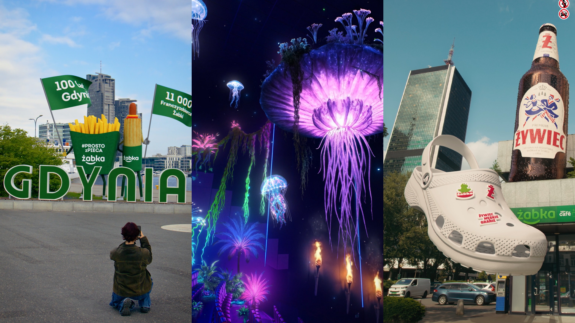

1. Czym w rzeczywistości jest FOOH?
FOOH (Fake Out of Home) to pojęcie, które w ostatnich latach przedefiniowało granice między rzeczywistością a kreacją cyfrową, stając się jednym z najskuteczniejszych narzędzi budowania zasięgów organicznych. W ujęciu technicznym jest to hybrydowy format reklamowy, który polega na osadzeniu fotorealistycznych obiektów 3D (CGI - Computer Generated Imagery) wewnątrz autentycznego nagrania wideo z fizycznej przestrzeni. Kluczowym elementem tej definicji jest słowo „osadzenie”. Nie mamy tu do czynienia z prostym montażem wideo, lecz z zaawansowaną kompozycją przestrzenną, w której cyfrowe obiekty muszą współdzielić perspektywę z tłem, ale także reagować na panujące w nim warunki oświetleniowe, cienie oraz fizyczne przeszkody.
Składowe sukcesu FOOH opierają się na trzech filarach: autentyczności bazy, precyzji trackingu oraz doskonałości 3D i postprodukcji. Baza, czyli nagranie wideo, często celowo imituje estetykę materiałów tworzonych przez użytkowników (UGC - User Generated Content). Wykorzystanie trzęsącej się kamery, nagłych zmian ostrości czy niedoskonałości kompozycyjnych sprawia, że mózg odbiorcy automatycznie klasyfikuje obraz jako „prawdziwy”, co obniża jego barierę obronną przed komunikatem reklamowym. Na tak przygotowany fundament nakłada się warstwę CGI, która musi zostać poddana procesowi dopasowania do kamery i głębi ostrości. Ta spójność sprawia, że niemożliwe z punktu widzenia fizyki zdarzenia - jak gigantyczne obiekty lewitujące nad rynkiem miasta - stają się dla widza wiarygodne.
FOOH jest ingerencją w znany odbiorcy kontekst fizyczny. Wykorzystanie globalnych lub lokalnych punktów orientacyjnych służy jako strategiczne zakotwiczenie komunikatu u odbiorcy. Rozpoznanie charakterystycznej architektury, jak Pałac Kultury, sprawia, że mózg automatycznie integruje cyfrowe obiekty z rzeczywistym otoczeniem.
Ciekawostka elomate: W procesie produkcji FOOH najbardziej krytycznym momentem nie jest sam model 3D, lecz proces trackowania kamery. Polega on na matematycznym odtworzeniu ruchu kamery z nagrania rzeczywistego w środowisku wirtualnym. Jeśli ten proces zostanie wykonany nieprawidłowo, mózg odbiorcy natychmiast wykryje nienaturalne „pływanie” obiektu, co zniszczy efekt i sprowadzi reklamę do poziomu taniego triku wideo.
Reklama FOOH wymaga od twórców zmysłu estetycznego i głębokiego zrozumienia fizyki światła i optyki. Technologie niegdyś zarezerwowane dla wysokobudżetowych produkcji z Hollywood, trafiły w ręce marek, pozwalając im na tworzenie reklam, których realizacja w świecie fizycznym byłaby technicznie niemożliwa lub logistycznie nieosiągalna.
2. Ewolucja formatu: Od realizmu do surrealizmu
Początki formatu FOOH były nierozerwalnie związane z dążeniem do absolutnego fotorealizmu i naśladowania fizycznych ograniczeń tradycyjnej reklamy zewnętrznej. Pierwsze viralowe produkcje starały się przekonać widza, że to, co widzi na ekranie telefonu, jest fizycznie istniejącą instalacją, której montaż byłby wprawdzie ekstremalnie trudny i kosztowny, ale teoretycznie możliwy. Dominowała estetyka „fake OOH” - gigantyczne torebki przesuwające się ulicami Paryża czy monumentalne bannery rozwijane na wieżowcach Dubaju. W tamtym okresie realizm był jedynym sposobem na wywołanie u widza efektu zaskoczenia. Im bardziej nagranie przypominało amatorski film zrobiony smartfonem przez przechodnia, tym silniejszy był zasięg organiczny kampanii.
Bardzo szybko jednak branża i sami odbiorcy zaczęli dostrzegać, że ograniczanie się wyłącznie do tego, co wykonalne w świecie fizycznym, drastycznie zawęża potencjał kreatywny marki. Nastąpił zwrot w stronę surrealizmu i pełnowymiarowych kampanii CGI, które przestały udawać fizyczną instalację, a zaczęły tworzyć nową, cyfrową warstwę rzeczywistości. Zrozumiano, że odbiorca wcale nie potrzebuje wierzyć, że dany obiekt istnieje naprawdę, aby poczuć ekscytację z jego oglądania. Ta zmiana pozwoliła markom na tworzenie scenariuszy całkowicie niemożliwych - od obiektów zmieniających swój stan skupienia aż po monumentalne maskotki ingerujące w architekturę miast.
Ta ewolucja pokazała, że surrealizm w FOOH paradoksalnie może wzmacniać branding. Gdy porzucamy próbę oszukania widza, że patrzy na prawdziwy billboard, zyskujemy przestrzeń na pokazanie DNA marki w sposób nieskrępowany. Przykładem tej zmiany jest realizacja elomate dla sieci Żabka, gdzie wielkie, animowane maskotki wbiegały na fasadę Pałacu Kultury i Nauki. Z punktu widzenia fizyki i logiki - sytuacja absolutnie niemożliwa. Jednak dzięki osadzeniu tych postaci w prawdziwym, znanym wszystkim kontekście Warszawy i zachowaniu realistycznych cieni oraz odbić, materiał zyskał gigantyczną popularność. Odbiorcy nie oceniali go przez pryzmat „prawdy”, lecz przez odwagi kreatywnej marki.
Ciekawostka elomate: Choć obiekt może być niemożliwy (np. lewitujący budynek), jego interakcja z otoczeniem musi być logiczna. Jeśli taki obiekt rzuca poprawny cień na sąsiednią kamienicę i odbija się w jej oknach, mózg widza akceptuje surrealizm jako część rzeczywistości. To właśnie detale pozwalają na całkowitą wolność w warstwie pomysłu.
Obecnie granica między „realnym” a „wykreowanym” nie przebiega już na linii pomysłu, ale na linii jakości wykonania. Marki, które rozumieją tę zmianę, przestają pytać: „Czy ludzie w to uwierzą?”, a zaczynają pytać: „Jak bardzo możemy ich tym zachwycić?”. Przejście od prostego udawania rzeczywistości do jej kreatywnego nadpisywania to moment, w którym FOOH stał się narzędziem komunikacji, gotowym do przejęcia roli głównego bohatera kampanii 360°.
3. FOOH a tradycyjne OOH
Tradycyjna reklama zewnętrzna (OOH) od dekad zmaga się z tymi samymi ograniczeniami: kosztami najmu powierzchni, logistyką druku oraz fizycznymi barierami konstrukcyjnymi. Nawet najbardziej innowacyjne instalacje są ograniczone do jednej, konkretnej lokalizacji geograficznej, co sprawia, że ich realny zasięg jest determinowany przez natężenie ruchu pieszego w danym punkcie miasta. W tym kontekście FOOH (Fake Out of Home) wywraca stolik do góry nogami, oferując markom możliwość stworzenia monumentalnej instalacji, która nie wymaga pozwoleń budowlanych i posiada potencjał globalnej dystrybucji w czasie rzeczywistym. Zamiast płacić za fizyczną obecność na Times Square, marka inwestuje w cyfrowe wytworzenie tej obecności, zyskując wielokrotnie wyższy zwrot z inwestycji dzięki wiralowej naturze formatu.
Technologia CGI, która niedawno była zarezerwowana wyłącznie dla największych studiów filmowych w Hollywood, stała się dziś dostępna dla sektora reklamowego, oferując poziom fotorealizmu niemożliwy do odróżnienia od rzeczywistości. Koszt produkcji zaawansowanego filmu FOOH, który obejrzy kilka milionów osób na całym świecie, jest często ułamkiem kwoty, jaką należałoby wydać na produkcję, montaż i wynajem powierzchni pod fizyczną instalację o podobnej skali. Dla FOOH nie istnieją ograniczenia materiałowe czy prawa grawitacji. Jedynym kosztem jest praca ekspertów, co pozwala markom budować w internecie struktury, których wzniesienie w świecie rzeczywistym byłoby logistycznym koszmarem lub finansowym samobójstwem.
Tradycyjny billboard rzadko staje się tematem rozmów przy kawie czy udostępnień w mediach społecznościowych. FOOH natomiast, dzięki efektowi zaskoczenia i zacieraniu granic realizmu, prowokuje odbiorców do interakcji. Każde udostępnienie, komentarz czy ponowne przesłanie filmu to darmowy zasięg, który drastycznie obniża jednostkowy koszt dotarcia. W efekcie kampania FOOH staje się samonapędzającym się mechanizmem dystrybucji treści, gdzie początkowy budżet produkcyjny zwraca się z nawiązką w postaci ekwiwalentu reklamowego.
FOOH nie jest konkurencją dla tradycyjnego OOH, lecz jego ewolucją w stronę mediów cyfrowych. Pozwala markom na „zajęcie” najbardziej prestiżowych lokalizacji na świecie bez konieczności fizycznej obecności na miejscu. Dla domów mediowych to narzędzie optymalizacji budżetów kampanii 360°, gdzie jeden wysokiej jakości materiał CGI może stać się głównym silnikiem zasięgowym całej komunikacji, deklasując pod względem efektywności tradycyjne, statyczne formaty.
4. FOOH jako kotwica kampanii 360°
Integracja formatów CGI z tradycyjnymi mediami to punkt zwrotny dla domów mediowych, które szukają sposobów na przełamanie kryzysu uwagi konsumenta. Traktowanie FOOH jako odizolowanego materiału ogranicza jego potencjał strategiczny. Prawdziwą skuteczność format ten osiąga w momencie, gdy staje się centralną kotwicą kampanii wielokanałowej, wokół której projektowana jest dalsza narracja. Taka synergia pozwala na stworzenie spójnego doświadczenia użytkownika.
Projektowanie kampanii z wykorzystaniem FOOH jako głównego bohatera wymaga zmiany myślenia. Zamiast traktować animację jako uzupełnienie, eksperci od planowania mediów wykorzystują ją do wywołania początkowego zaskoczenia, które generuje organiczną dyskusję publiczną i publikacje PR-owe. Wywołany w ten sposób szum wokół marki stanowi idealne podłoże pod wprowadzenie standardowych formatów, które pełnią funkcję domykającą i sprzedażową.
Włączenie FOOH do głównego nurtu kampanii 360° wymaga ścisłej dyscypliny od zespołów kreatywnych. Animacja nie może być oderwana od głównego hasła ani od celów biznesowych. Musi stanowić ich wizualną esencję. Dopiero wtedy, gdy dynamiczny obiekt 3D bezpośrednio odzwierciedla benefity produktu lub pozycjonowanie firmy, format ten przestaje być jednorazowym pokazem możliwości technicznych, rozwijając sprzedaż i rozpoznawalność w skali całego rynku.
5. Pola minowe prawa: "Wizerunek" budynku i prawa autorskie
Realizacja kampanii FOOH w przestrzeni publicznej wymaga rygorystycznej analizy prawnej. Szybki rozwój tej technologii wyprzedził ramy legislacyjne w wielu krajach, co sprawia, że poruszanie się w obszarze praw autorskich i ochrony obiektów architektonicznych bywa skomplikowane. Powszechnym błędem w branży reklamowej jest przekonanie, że skoro dany budynek znajduje się w przestrzeni publicznej i jest widoczny dla każdego, może być dowolnie modyfikowany w cyfrowym materiale komercyjnym. Kluczowym zagadnieniem staje się tutaj relacja między ustawową wolnością panoramy a ochroną praw autorskich twórców projektu architektonicznego. O ile prawo pozwala na nieodpłatne rozpowszechnianie utworów wystawionych na stałe na ogólnie dostępnych drogach czy placach, o tyle komercyjna, cyfrowa modyfikacja tych utworów - na przykład poprzez dodanie gigantycznej postaci ingerującej w strukturę fasady - może zostać uznana za naruszenie integralności utworu architektonicznego.
Samo pojęcie wizerunku w polskim porządku prawnym odnosi się co do zasady do osób fizycznych, a nie do obiektów budowlanych. To prowadzi do wniosku, że budynek jako bryła nie posiada autonomicznego prawa do wizerunku, które mogłoby zostać naruszone przez sam fakt jego sfilmowania. Z drugiej strony warto spojrzeć na to przez pryzmat ochrony własności prywatnej lub praw korporacyjnych zarządzających prestiżowymi obiektami. Wiele instytucji lub prywatnych konsorcjów zastrzega charakterystyczny kształt architektoniczny budynku jako przestrzenny znak towarowy. Wykorzystanie takiego obiektu w kampanii o charakterze stricte komercyjnym bez wcześniejszej autoryzacji naraża markę na zarzut nieuczciwej konkurencji lub naruszenia praw ochronnych do znaku, co drastycznie podnosi ryzyko prawne całego przedsięwzięcia.
Wszystko zależy od konkretnego pomysłu na reklamę, charakteru modyfikacji oraz statusu prawnego wybranej lokacji. W elomate® od samego początku pojawienia się formatu FOOH traktujemy aspekty prawne jako integralny i krytyczny element fazy preprodukcji. Każda koncepcja kreatywna oraz wybrana lokalizacja przechodzą przez proces weryfikacji przez zespół wyspecjalizowanych prawników, którzy analizują ryzyko. Taka prewencyjna analiza pozwala na modyfikację założeń projektowych na wczesnym etapie lub uzyskanie wymaganych zgód, zapewniając marce pełne bezpieczeństwo przed ewentualnymi roszczeniami odszkodowawczymi ze strony twórców lub zarządców nieruchomości.
Bezpieczeństwo prawne kampanii FOOH nie polega na unikaniu charakterystycznych czy ikonicznych budynków, lecz na wypracowaniu sprawdzonych procedur i posiadaniu merytorycznego wsparcia od pierwszych dni pracy nad projektem. Duże marki oraz domy mediowe nie mogą pozwolić sobie na działanie w strefie ryzyka, dlatego standaryzacja procesów prawnych, obok procesów technologicznych, jest warunkiem koniecznym do sprawnego dowiezienia produktu. Przepracowany proces i współpraca z ekspertami gwarantują, że gotowa kampania przyniesie oczekiwane, wiralowe zasięgi bez negatywnych konsekwencji wizerunkowych i prawnych.
6. Zespół do zadań specjalnych: Kto tworzy reklamy FOOH?
Skala technologiczna, prawna i strategiczna profesjonalnych realizacji FOOH wymaga zaangażowania wyspecjalizowanego, interdyscyplinarnego zespołu. Na samym początku tego łańcucha stoją strategowie i kreatywni, których głównym zadaniem jest dopasowanie koncepcji do celów kampanii oraz tożsamości marki. To oni decydują, czy dynamiczny obiekt ma bawić, czy raczej pokazać innowacyjność technologiczną, dbając o to, by każda sekunda animacji miała swoje uzasadnienie w szerszym DNA firmy.
Gdy koncepcja zyska akceptację, do procesu wkracza ekipa wideo, odpowiedzialni za pozyskanie idealnego materiału bazowego. Praca w terenie to precyzyjne planowanie uwzględniające porę dnia, kąt padania promieni słonecznych oraz specyfikę optyki obiektywu, co ma kluczowe znaczenie dla późniejszego realizmu. Równolegle, jak wykazano w poprzednim rozdziale, kluczowe analizy prowadzą prawnicy, którzy weryfikują status lokacji pod kątem wolności panoramy i praw ochronnych do obiektów, eliminując ryzyko roszczeń zanim projekt przejdzie do kolejnych etapów.
3D i motion artyści budują cyfrowe bliźniaki obiektów i integrują je z rzeczywistym tłem. To oni odpowiadają za modelowanie, mapowanie tekstur, symulację fizyki oraz perfekcyjne dopasowanie oświetlenia zgrane z warunkami panującymi na planie wideo. Dopełnieniem ich pracy jest warsztat montażystów i specjalistów od postprodukcji (compositingu), którzy ostatecznie scalają warstwę realną z wirtualną, maskując elementy tła i nakładając ziarno kamery. Dopełnieniem całego procesu jest praca sound designerów. Dzięki efektom dźwiękowym sprawiają oni, że cyfrowe obiekty stają się jeszcze bardziej realne.
Posiadanie tak zróżnicowanych kompetencji wewnątrz jednej struktury projektowej to jedyny sposób na sprawne dowiezienie bezproblemowego i bezpiecznego produktu. Duże domy mediowe i globalne marki poszukują partnerów, którzy posiadają zaplecze technologiczne oraz przepracowany i sprawdzony w bojach proces produkcyjny. Zintegrowanie ról kreatywnych, technicznych i prawnych w jednym zespole eliminuje ryzyko błędów na styku różnych etapów prac. Gdy proces ten działa bez zarzutu, faza od wizji lokalnej do finalnego renderu zamyka się w przewidywalnych ramach czasowych, a gotowy materiał osiąga miliony wyświetleń bez barier technicznych czy organizacyjnych.
7. Psychologia odbiorcy: Czy ludzie czują się oszukani?
Skuteczność kampanii FOOH zależy przede wszystkim od sposobu, w jak odbiorcy przetwarzają cyfrową iluzję. W początkowej fazie rozwoju tego formatu w branży dominowała obawa, że ujawnienie mistyfikacji wywoła u konsumentów poczucie manipulacji, co bezpośrednio przełoży się na negatywny sentyment wobec marki. Praktyka rynkowa zweryfikowała tę tezę, wskazując, że kluczem do pozytywnej reakcji nie jest ukrywanie faktu wykorzystania CGI. Odbiorcy nie odrzucają iluzji, o ile wnosi ona unikalną wartość estetyczną lub rozrywkową, stając się manifestem odwagi twórczej marki, a nie próbą cynicznego wprowadzenia w błąd.
Negatywne reakcje pojawiają się głównie wtedy, gdy pomysł jest oklepany, wtórny i nie wnosi do przestrzeni niczego nowego. Konsumenci błyskawicznie dekodują intencje twórców i omijają materiały, które bezrefleksyjnie kopiują rozwiązania konkurencji, niezależnie od stopnia zaawansowania użytej technologii. Psychologiczna akceptacja cyfrowej ingerencji opiera się na mechanizmie zbliżonym do tego, który towarzyszy nam podczas seansu kinowego. Widzowie świadomie zawieszają niewiarę, jeśli zaoferowany im świat jest wystarczająco intrygujący. Jeśli intencją projektu jest zachwycenie widza niemożliwą, surrealistyczną wizją, odbiorca reaguje podziwem dla innowacyjności i humoru marki, chętnie dzieląc się materiałem w swoich kanałach, co eliminuje ryzyko wizerunkowe.
Kluczowym czynnikiem kształtującym pozytywny sentyment jest unikanie budowania narracji opartej na dosłownym kłamstwie informacyjnym. Zrozumienie psychologii tłumu cyfrowego pozwala na wywoływanie odpowiednich emocji wokół kampanii. Zamiast obawiać się zarzutów o „sztuczność”, brand managerowie powinni traktować technologię CGI jako unikalną szansę na rozszerzenie świata marki o elementy, których fizyczna budowa byłaby niemożliwa. Gdy proces ten opiera się na strategicznej celowości i szacunku dla estetyki przestrzeni, granica między rzeczywistością a kreacją przestaje być barierą, a staje się przestrzenią, w której rodzi się autentyczne, długofalowe zaangażowanie konsumentów.
8. Trend czy stały element krajobrazu?
Szybka popularyzacja formatów przestrzennych CGI wywołała w branży reklamowej dyskusję na temat żywotności tego zjawiska. Część analityków głównego nurtu pospieszyła z tezą, że FOOH (Fake Out of Home) to jedynie krótkotrwała moda, która zniknie z chwilą, gdy odbiorcy przyzwyczają się do cyfrowych iluzji i stracą pierwotne poczucie zaskoczenia. Tego typu prognozy wynikają z powierzchownego zrozumienia ewolucji mediów i są obalane przez twarde dane rynkowe. Formaty te rozwijają się stabilnie już od kilku lat, a globalne statystyki zaangażowania i zasięgów organicznych nie wykazują tendencji spadkowych. Traktowanie FOOH jako chwilowej mody jest błędem. Naszym zdaniem mamy do czynienia z narodzinami zupełnie nowego, autonomicznego formatu reklamowego, który na stałe wpisał się w cyfrowy krajobraz mediowy.
Zarzut o rychłym „opatrzeniu się” formatu można odnieść do każdego innego nośnika komunikacji wizualnej, od klasycznego spotu wideo po statyczną grafikę. Jeśli pomysł kreatywny jest oklepany, wtórny i nie wnosi żadnej nowej wartości, materiał zostanie pominięty przez użytkowników, niezależnie od tego, czy został zrealizowany w technologii 3D, czy jako tradycyjne zdjęcie. Spadek efektywności niektórych kampanii CGI nie wynika zatem ze zmęczenia samą technologią, lecz z kreatywnego lenistwa twórców, którzy bezrefleksyjnie kopiują istniejące wzorce. FOOH, jako format oparty na innowacji, wymaga ciągłej redefinicji barier kreatywnych. Dopóki marki potrafią zaskakiwać odbiorców świeżym humorem, surrealistyczną fizyką i unikalnym storytellingiem, format ten będzie utrzymywał swoją gigantyczną skuteczność wiralową.
To prowadzi nas ewolucji technologicznej, która w najbliższych latach połączy FOOH z rzeczywistością rozszerzoną (AR). Dzisiejsze filmy CGI oglądane na ekranach smartfonów to zaledwie faza przejściowa. Prawdziwy potencjał tego formatu uwolni się w momencie, gdy cyfrowe instalacje zostaną zintegrowane z inteligentnymi okularami AR, pozwalając na oglądanie wirtualnych struktur w czasie rzeczywistym bezpośrednio w tkance miejskiej. Marki, które już teraz inwestują w przepracowanie procesów produkcyjnych i prawnych związanych z FOOH, budują kapitał technologiczny, który pozwoli im płynnie wejść w erę interaktywnego, trójwymiarowego marketingu przestrzennego.
Stabilność formatu potwierdza fakt, że duże domy mediowe zaczęły traktować CGI jako standardowy komponent budżetowy w kampaniach 360°, a nie jako ryzykowny eksperyment. Zdolność FOOH do generowania gigantycznych zasięgów organicznych przy relatywnie niskim nakładzie sprawia, że jest to doskonała odpowiedź na rosnące koszty tradycyjnego zakupu mediów płatnych. Dopóki ekrany cyfrowe pozostają głównym miejscem walki o uwagę konsumenta, technologia pozwalająca na kreatywne nadpisywanie rzeczywistości będzie ważnym narzędziem budowania przewagi konkurencyjnej nowoczesnych przedsiębiorstw.
9. Odwaga jako warunek konieczny
Zwieńczeniem analizy nadchodzącej ery marketingu przestrzennego musi być powrót do fundamentalnego czynnika ludzkiego, który ostatecznie decyduje o sukcesie komercyjnym i wiralowym. Choć technologia CGI osiągnęła poziom zaawansowania umożliwiający bezbłędne osadzanie iluzji w tkance miejskiej, a domy mediowe potrafią precyzyjnie wyliczyć ekwiwalent reklamowy, nadrzędnym czynnikiem różnicującym markę na rynku pozostaje odwaga kreatywna. Infrastruktura technologiczna i moc obliczeniowa procesorów uległy demokratyzacji, co oznacza, że bariera wejścia do świata wysokobudżetowych efektów wizualnych przestaje istnieć. W tym enowym rozdaniu rynkowym prawdziwym wąskim gardłem nie jest już budżet produkcyjny, lecz odwaga do przekroczenia schematów i zaoferowania odbiorcom czegoś, co przełamie rutynę ich codzienności.
To prowadzi nas do filozofii, na której elomate buduje swoje podejście do projektowania ruchu. Nie jesteśmy agencją od wszystkiego - specjalizujemy się w projektowaniu ruchu, który uwalnia marki od wizualnej przeciętności i buduje realną przewagę rynkową. Wierzymy, że każda sekunda animacji i każda ingerencja w przestrzeń publiczną musi mieć swoje bezwzględne uzasadnienie w strategii marki, ale ta celowość nie może oznaczać zachowawczości. Marki, które próbują traktować FOOH jako bezpieczny, tradycyjny billboard, marnują potencjał tego nośnika. Sukces wymaga zgody na kontrolowany surrealizm, wyjście poza fizyczne ramy i pełne zaufanie procesom produkcyjnym, które z definicji mają wywołać zaskoczenie u konsumenta.
We współczesnej gospodarce opartej na uwadze, autentyczność pomysłu staje się najcenniejszym aktywem firmy. Stawianie na autorskie, unikalne rozwiązania to jedyna droga do stworzenia trwałego kapitału wizerunkowego, ponieważ każda próba naśladownictwa lub bezrefleksyjnego kopiowania cudzych wirali pozostanie jedynie wtórną, ignorowaną przez odbiorców kopią. Z drugiej strony warto spojrzeć na odwagę kreatywną jako na inwestycję o najwyższej stopie zwrotu. Kiedy firma decyduje się na realizację projektu o wysokim stopniu unikalności, jak wspomniane wbiegające na Pałac Kultury maskotki, nie tylko generuje zasięgi organiczne, ale manifestuje swoją pozycję lidera, który nie boi się dyktować nowych reguł komunikacji wizualnej.
Podsumowując, format FOOH i zaawansowane kampanie CGI ostatecznie redefiniują pojęcie reklamy zewnętrznej i cyfrowej. Ruch stał się nowym fundamentem brandingu. Dopracowana forma wideo i techniczna doskonałość są u nas standardem oraz punktem wyjścia dla każdego projektu, a świeży, bezkompromisowy pomysł decyduje o tym, czy iluzja zamieni się w kapitał marki.

Entuzjazm, który bywa pułapką
Kiedy klient przychodzi do nas z hasłem „chcemy animację”, zazwyczaj towarzyszy mu pewna wizja plastyczna. Może widział świetną produkcję u konkurencji, a może zainspirowała go dynamiczna reklama z zupełnie innej branży. To naturalne, że szukamy punktów odniesienia w tym, co nam się podoba, jednak warto spojrzeć na to inaczej. Film w biznesie nie jest dziełem, które ma cieszyć oko twórcy lub właściciela firmy. Jest on narzędziem komunikacji, które ma wykonać konkretną pracę: przekonać nieprzekonanych, wyjaśnić zawiłe procesy technologiczne lub skrócić proces decyzyjny klienta.
Mało tego, często obserwujemy zjawisko, w którym firmy próbują „zakrzyczeć” brak jasnej strategii komunikacyjnej efektowną oprawą wizualną. Wydaje się, że jeśli animacja będzie wystarczająco płynna, to nikt nie zauważy, że przekaz jest niejasny. To podejście działa, dopóki odbiorca tylko patrzy. Kiedy jednak przychodzi moment, w którym ma on podjąć decyzję zakupową lub zrozumieć unikalną wartość usługi, sam obrazek przestaje wystarczać. W elomate każdą współpracę zaczynamy od próby zrozumienia, co właściwie chcemy naprawić, bo dopiero gdy zidentyfikujemy konkretny punkt oporu, możemy dobrać odpowiednie środki wyrazu.
Czego naprawdę szuka Twój klient?
Weźmy na warsztat konkretną sytuację. Klient jest przekonany, że musi drobiazgowo wytłumaczyć, jak jego produkt działa od strony technicznej. Chce pokazać każdą zębatkę, każdy wiersz kodu i każdy proces zachodzący „pod maską”. Tymczasem po głębszej analizie okazuje się, że jego odbiorcy zupełnie to nie obchodzi. Dla nich liczy się tylko to, jakie problemy to rozwiązanie eliminuje z ich codzienności. Może kluczową wartością jest fakt, że wszystkie usługi są w jednym miejscu, a w razie jakiejkolwiek awarii klient ma pełne, natychmiastowe wsparcie? Jeśli tak jest, to właśnie te aspekty musimy uwydatnić w produkcji.
Animacja jest skrótem myślowym, a jej siła drzemie w tym, że potrafi w kilkadziesiąt sekund wyjaśnić to, co w tekście zajęłoby kilka stron. Jednak aby ten skrót był czytelny, musimy wiedzieć, skąd i dokąd prowadzimy naszego widza. Jeśli zaczniemy od końca, czyli od wyboru kolorystyki i stylu ilustracji, pomijając etap analizy potrzeb, ryzykujemy stworzenie materiału, który będzie estetyczny, ale całkowicie nieskuteczny.
Estetyka to nie wszystko
W elomate wierzymy, że ruch jest naturalnym przedłużeniem identyfikacji wizualnej, a nie tylko dodatkiem do niej. To prowadzi nas do kluczowej kwestii: jak sprawić, by animacja nie zestarzała się po jednym sezonie? Odpowiedź jest prosta - musimy traktować ją tak samo jak branding. Logotypu nie projektuje się pod aktualnie panujące, ulotne trendy; projektuje się go tak, by idealnie pasował do tożsamości marki. Z ruchem jest dokładnie tak samo. Dobra animacja starzeje się powoli.
Współczesny odbiorca, jest niezwykle wyczulony na pusty marketing. Szuka konkretów, wartości i zrozumienia swoich problemów. Jeśli dostanie od nas film, który jest tylko pokazem slajdów, poczuje, że zmarnowaliśmy jego czas. Dlatego kładziemy tak duży nacisk na to, by być partnerem strategicznym, a nie tylko wykonawcą zlecenia. Nie interesuje nas tworzenie kolejnej rzeczy, która zniknie w odmętach internetu po dwóch tygodniach od premiery.
Pytanie, które zmienia wszystko
Zanim uruchomimy pierwsze klatki renderu, warto zadać sobie pytanie, które początkowo może wydawać się niewygodne: „Co się stanie, jeśli tej animacji nie zrobimy?”. To nie jest próba zniechęcenia do projektu, lecz test na jego zasadność biznesową. Jeśli jedyną odpowiedzią jest to, że „konkurencja ma filmy” albo „nasza strona wygląda pusto”, to znak, że musimy cofnąć się o krok. Prawdziwa wartość ruchu ujawnia się wtedy, gdy potrafimy przypisać mu konkretne zadanie w lejku sprzedażowym lub wizerunkowym.
Z drugiej strony warto spojrzeć na animację jako część całego ekosystemu marki. Jeśli nie wynika ona z głębszego zrozumienia tego, kim jesteście jako firma, może stać się ciałem obcym w komunikacji. Zamiast budować zaufanie, wprowadza chaos i poczucie przypadkowości. Kiedy myślimy o ruchu jako o narzędziu, zaczynamy zastanawiać się nad jego dystrybucją i tym, jakimi emocjami ma emanować, by pasować do charakteru marki premium. To działanie wymaga czasu i refleksji, ale tylko ono gwarantuje sukces.
Partnerstwo zamiast zwykłego wykonawstwa
Przyjęcie perspektywy, w której animacja jest narzędziem, nakłada na obie strony projektu dużą odpowiedzialność. Po stronie studia leży obowiązek zadawania trudnych pytań i korygowania intuicji klienta, gdy te prowadzą w ślepą uliczkę. Po stronie klienta z kolei leży gotowość do spojrzenia na swój biznes z dystansem i zdefiniowania realnych wyzwań, z którymi mierzy się jego marka. Być może rozmowa o celach biznesowych brzmi mniej ekscytująco niż dobieranie efektów specjalnych, ale to właśnie ten proces pozwala tworzyć produkcje, które mają sens.
Wierzymy, że profesjonalizm polega na tym, by nie bać się przyznać, że czasem najlepszym wyjściem nie jest „zrobienie filmu”, ale zmiana sposobu myślenia o komunikacji z rynkiem. Dopiero na takim fundamencie można budować animacje, które działają. Pozostaje zatem pytanie: planując kolejny materiał wideo, zastanawialiście się nad tym, jaki realny problem ma on rozwiązać, czy po prostu ulegliście pokusie posiadania czegoś, co jest teraz w modzie? Odpowiedź na to pytanie zazwyczaj determinuje to, czy projekt okaże się mądrą inwestycją, czy jedynie kolejnym wydatkiem w budżecie marketingowym.

Dlaczego odbiorcy są dziś tak przytłoczeni?
Zastanówmy się, jak wygląda przeciętny dzień współczesnego człowieka. Wystarczy rano spojrzeć na telefon, by zobaczyć dziesiątki powiadomień: kalendarze, przypomnienia, maile, wiadomości od znajomych i rodziny, a do tego dochodzą jeszcze aplikacje społecznościowe i reklamy targetowane na podstawie naszych ostatnich wyszukiwań. Nic dziwnego, że jesteśmy zmęczeni ciągłym przetwarzaniem informacji. W takim otoczeniu, by przyciągnąć uwagę odbiorcy i utrzymać ją dłużej niż kilka sekund, trzeba się mocno postarać.
Kluczowym problemem jest przeciążenie informacyjne. Podobno jesteśmy wystawieni na kontakt z tysiącami komunikatów reklamowych dziennie. Próba ich „przemielenia” powoduje, że nasz umysł automatycznie blokuje to, co uzna za nieistotne. Łatwo w ten sposób przeoczyć treści, które mogą być dla nas przydatne – i odwrotnie: firmy, mimo iż mają wartościowy produkt, nie są w stanie przebić się do świadomości potencjalnych klientów.
Krótki czas uwagi i brak zaangażowania
Do tego dochodzi kolejny czynnik: krótki czas uwagi. Współcześni odbiorcy mają mniejsze skupienie niż kiedykolwiek wcześniej. Czy to prawda, czy mit – nie będziemy tu rozstrzygać. Faktem jest, że ludzie coraz rzadziej czytają długie, skomplikowane treści. Wolą coś szybkiego, dynamicznego, co od razu przykuje ich wzrok i zachęci do dalszej interakcji. Gdy treść jest zbyt długa lub źle zaprojektowana, zostaje zwyczajnie pominięta, bo nikt nie ma czasu lub cierpliwości, by się przez nią przebić.
Firmy, zdając sobie sprawę z tej sytuacji, coraz częściej szukają metod, które pozwolą im przekazać maksimum kluczowych informacji w jak najkrótszej formie. Jednym z rozwiązań jest właśnie animacja – dynamiczna, przekazująca najważniejsze informacje, a do tego łatwa w odbiorze i zapadająca w pamięć.
Animacja jako odpowiedź na problem nadmiaru informacji
Animacja pozwala w skuteczny sposób przekazać kluczowe treści w przystępnej i angażującej formie. Łączy w sobie siłę obrazu, ruchu i dźwięku, co czyni ją bardziej atrakcyjną niż statyczne materiały. W zaledwie kilkudziesięciosekundowym filmie można skondensować całkiem rozbudowany przekaz, który w formie tradycyjnego artykułu mógłby liczyć tysiące znaków.
Przyciąganie uwagi
Wyobraź sobie scrollowanie mediów społecznościowych – co zatrzymuje nasz wzrok? Zwykle jest to coś, co się rusza. Dynamiczny obraz, animacja lub krótkie wideo. Dlatego animacje mają przewagę nad nudnym ciągiem tekstu lub statyczną grafiką. Odbiorca przestaje się nudzić, bo w zaledwie parę sekund otrzymuje syntezę tego, co chcesz przekazać.
Ułatwianie zrozumienia
Kolejną ogromną zaletą animacji jest możliwość wizualizacji skomplikowanych informacji. Jeśli np. Twój produkt wykorzystuje zaawansowaną technologię, można ją przedstawić krok po kroku w animacji typu explaier wideo. W ten sposób nawet osoba bez głębokiej wiedzy technicznej będzie w stanie zrozumieć, na czym polega działanie Twojego rozwiązania. Dzięki temu klienci nie czują się przytłoczeni nadmiarem detali, a firma zyskuje opinię kogoś, kto potrafi klarownie wytłumaczyć nawet trudne zagadnienia. Musimy pamiętać też o tym, że ludzie kupują to co rozumieją.
Jak animacje pomagają w przekazaniu tego, co najważniejsze?
Kiedy myślimy o animacjach, przed oczyma stają nam krótkie filmy, które selekcjonują najważniejsze treści i przedstawiają je w formie lekkiej, interesującej historii. To właśnie jest skuteczna komunikacja w erze przesytu informacyjnego.
1. Skrócenie i uproszczenie przekazu
Jednym z kluczowych wyzwań marek jest skrócenie komunikatu do absolutnego minimum, bez utraty istotnych treści. Animacje pozwalają przedstawić esencję oferty w kilkudziesięciosekundowym spocie. Zamiast rozległej prezentacji, Twój odbiorca dostaje pigułkę wiedzy, którą może szybko „przetrawić”.
2. Wykorzystanie storytellingu
Ludzie są istotami, które od zawsze kochają historie. Storytelling w animacji angażuje emocjonalnie odbiorców, dzięki czemu dłużej pozostają skupieni i chętniej zapoznają się z dalszą częścią przekazu. Historia staje się mostem między marką a człowiekiem.
3. Wizualizacja danych
Wiele firm ma do przekazania rozbudowane statystyki czy dane liczbowe, które w formie tekstowej wyglądają przytłaczająco. Animowane infografiki przedstawią je w zrozumiały sposób. W animacji możesz pokazać wzrost sprzedaży, udział w rynku, dynamikę trendu czy rozkład danych.
4. Dostosowanie treści
Różni odbiorcy – różne potrzeby. Zamiast przygotowywać jedną, uniwersalną animację, można stworzyć kilka krótkich wariantów dopasowanych do konkretnych grup docelowych. Jeśli Twoja marka kieruje inne komunikaty do młodszych użytkowników, inne do profesjonalistów, a jeszcze inne do klientów zagranicznych, animacja może to wszystko odzwierciedlić w spójny i atrakcyjny sposób.
Korzyści dla marki
Sprawna i trafiająca w sedno animacja nie tylko przykuwa uwagę potencjalnych klientów. Przede wszystkim zwiększa zrozumienie tego, co chcesz im przekazać. Ludzie cenią sobie firmy, które jasno i przystępnie potrafią wyjaśnić, czym się zajmują i dlaczego ich oferta jest wyjątkowa.
Zwiększona satysfakcja klientów
Gdy odbiorca szybko otrzymuje odpowiedzi na pytania, oszczędza swój czas i czuje, że marka dba o jego wygodę. To przekłada się na pozytywny odbiór firmy oraz większą lojalność.
Pozytywne doświadczenie z marką
Dobrze zaprojektowana animacja może wywoływać pozytywne emocje, co buduje skojarzenia z jakością i profesjonalizmem. W efekcie firma zyskuje przewagę konkurencyjną, bo w umysłach klientów jawi się jako nowoczesna, pomysłowa i skuteczna.
Większe zaangażowanie
Animacje zachęcają do interakcji. Kto z nas nie udostępnił nigdy w mediach społecznościowych atrakcyjnego wideo czy nie skomentował go ze znajomymi? Właśnie ta "viralowość" może znacznie zwiększyć zasięg przekazu i przyciągnąć nowych odbiorców, którzy w przeciwnym razie mogliby nigdy o Twojej marce nie usłyszeć.
Wyższa skuteczność marketingowa
Połączenie dynamicznej formy przekazu z dobrze przygotowanym scenariuszem pozwala firmom znacznie zwiększyć wskaźniki konwersji. Ludzie lepiej rozumieją ofertę, a tym samym chętniej decydują się na zakup produktów czy usług.
Praktyczne zastosowania animacji
- Animacje produktowe: Możesz w prosty sposób przedstawić kluczowe cechy i korzyści, np. jak działa urządzenie, jakie problemy rozwiązuje.
- Explainer wideo: Krótkie, dynamiczne filmy tłumaczące w przystępny sposób działanie produktu, usługi czy złożonych procesów. Najczęściej trwają od 60 do 90 sekund, skupiając się na najważniejszych korzyściach. Ich celem jest szybkie i skuteczne wyjaśnienie, co oferujesz i dlaczego warto skorzystać właśnie z Twojej oferty.
- Animowane instrukcje: Zamiast skomplikowanych instrukcji tekstowych, krótkie filmy wyjaśniające „krok po kroku” korzystanie z produktu bądź usługi.
- Animacje edukacyjne: Doskonałe narzędzie w szkoleniach, czy wewnętrznych kursach firmowych. Przekazuj wiedzę w formie krótkich, zapadających w pamięć lekcji.
- Kampanie marketingowe: Krótka, efektowna animacja może stać się punktem centralnym promocji w mediach społecznościowych, serwisach wideo czy na stronach lądowania.
Jak zacząć?
1. Zidentyfikuj kluczowe informacje, które pragniesz przekazać. Zastanów się, co w Twojej ofercie jest najistotniejsze i co powinni zrozumieć klienci w krótkim czasie.
2. Określ grupę docelową i dostosuj styl animacji do jej preferencji.
3. Współpracuj z profesjonalnym studiem animacji, które przygotuje skuteczną i atrakcyjną treść wizualną, uwzględniając Twoje cele biznesowe strategię oraz wizerunek marki.
4. Testuj i mierz efekty – sprawdzaj statystyki wyświetleń, zaangażowanie odbiorców oraz ich reakcje (komentarze, udostępnienia). Na tej podstawie doskonal kolejne animacje, by jeszcze lepiej trafiać w potrzeby rynku.
Skuteczne przekazanie najważniejszych treści stanowi nie lada wyzwanie. Animacje okazują się tu niezwykle pomocne, bo nie tylko przyciągają wzrok i zapadają w pamięć, ale przede wszystkim pozwalają szybko i klarownie wyeksponować kluczowe aspekty Twojej oferty. Potrafią skrócić i uprościć przekaz, zaangażować widzów narracją czy wizualizacją danych i zapewnić przyjemne doświadczenie z Twoją marką.
Jeśli masz wrażenie, że Twoje treści giną w zalewie rozpraszających reklam i wiadomości, rozważ wprowadzenie animacji jako narzędzia komunikacji. Skontaktuj się z elomate, a pomożemy Ci stworzyć kreacje, które wywołają konkretny efekt – od wzrostu świadomości marki, przez lepszą sprzedaż, aż po skuteczne przekazanie skomplikowanych informacji w zrozumiały sposób. Nie pozwól, by Twój przekaz zginął w tłumie – ożyw go animacją, która przyciągnie uwagę i trafi prosto w potrzeby Twoich klientów.

Brak czasu - największe wyzwanie współczesnego marketingu
Zastanów się, ile razy dziennie zdarza Ci się przewinąć artykuł lub zamknąć okno przeglądarki, ponieważ treści były zbyt obszerne lub niestrawne. Nie chodzi tylko o to, że ludzie nie lubią czytać, ale że nadmiar obowiązków i bodźców wymaga od nich szybkiego przetwarzania informacji. Długie dokumenty, rozbudowane prezentacje i niezliczone raporty zazwyczaj nie mają szans przebić się do zabieganego użytkownika.
Pamiętajmy, że na rynku działa wiele marek, które walczą o uwagę tego samego klienta. W tym wyścigu wygrywa zazwyczaj ten, kto skuteczniej dotrze do odbiorcy w możliwie krótkim czasie i w przystępnej formie.
Dlaczego tradycyjne materiały marketingowe nie wystarczają?
W kontekście nadmiaru treści, tradycyjne formy komunikacji mogą łatwo zginąć w tłumie. Przyczyn jest co najmniej kilka. Ludzie są nieustannie zalewani treściami, co utrudnia przyswojenie i zapamiętanie długich, szczegółowych opisów. Obecnie większość osób woli krótkie, wizualne formy przekazu, takie jak filmy czy infografiki. Czasy długich artykułów czy rozbudowanych broszur stopniowo odchodzą w cień. W natłoku codziennych obowiązków klienci rzadko mają wolną chwilę, by przebrnąć przez obszerne raporty czy wielostronicowe prezentacje.
Animacja jako skuteczne narzędzie komunikacji
W tym miejscu wkracza animacja – krótka i treściwa forma, która w efektywny sposób pozwala przekazać kluczowe informacje, oszczędzając czas odbiorców. Ale dlaczego animacje tak dobrze sprawdzają się w kontekście marketingu?
W ciągu kilkudziesięciu sekund można zaprezentować najważniejsze aspekty oferty, takie jak korzyści, wyróżniki i przykłady zastosowania. Zamiast wielostronicowego PDF-a czy przydługiej prezentacji, klient dostaje esencję produktu lub usługi w przystępnej formie wideo.
Animacje łączą w sobie ruch, kolor, dźwięk i odpowiednio dobraną narrację. Takie połączenie zmysłów sprawia, że odbiorca skupia się na przekazie chętniej niż na statycznym tekście. To jeden z powodów, dla których filmy animowane odnoszą tak duży sukces w mediach społecznościowych.
Wizualne treści są zdecydowanie lepiej zapamiętywane niż sam tekst. Gdy coś widzimy w ruchu i słyszymy towarzyszące temu komunikaty, informacje mocniej zapadają w pamięć. Odbiorca może dzięki temu łatwiej przypomnieć sobie Twój produkt lub usługę.
Animacje można łatwo dostosować do wielu kanałów – stron internetowych, mediów społecznościowych, prezentacji handlowych czy nawet e-mail marketingu. Oznacza to, że raz stworzony materiał może z powodzeniem funkcjonować w kilku różnych formatach, od krótkich stories na Instagramie po dłuższe filmy na YouTube.
Jak animacja pomaga w oszczędzaniu czasu odbiorców?
Zamiast zmuszać klientów do przeglądania długiego PDF-a, możesz skondensować najważniejsze informacje w krótkim filmie animowanym. Kluczowe zalety produktu lub usługi zostaną wyróżnione i podane w przystępnej formie.
Duże dokumenty marketingowe często zawierają nadmiar detali, które tylko rozpraszają odbiorców i zniechęcają do dalszego czytania. W animacji możesz skupić się na tym, co faktycznie istotne – korzyściach, zastosowaniach i unikalnych cechach Twojej oferty.
Animacje zwykle są bardziej angażujące niż statyczne obrazy lub długie akapity tekstu. Ciekawa narracja, przyjemna ścieżka dźwiękowa i dynamiczny montaż sprawiają, że klient z większym prawdopodobieństwem obejrzy materiał do końca i zapamięta kluczowe informacje.
Praktyczne zastosowania animacji w marketingu
Krótkie filmy promocyjne
Idealne do przedstawienia nowego produktu czy usługi w kilkudziesięciosekundowej formie wideo. Taki materiał można następnie udostępniać w mediach społecznościowych, na stronie internetowej czy w mailingu.
Animowane infografiki
Dane, statystyki czy wyniki badań w formie statycznej bywają mało atrakcyjne. Ale kiedy zostaną przedstawione jako animowana infografika, mogą stać się wyjątkowo interesujące i łatwo przyswajalne. Dodatkowo użytkownicy chętniej udostępniają takie treści na swoich profilach, co zwiększa zasięg Twojego przekazu.
Prezentacje sprzedażowe
Zamiast zasypywać potencjalnych klientów slajdami pełnymi tekstu i tabel, zastosuj animacje, które dynamicznie przedstawią Twój produkt lub usługę. Dzięki temu prezentacja będzie bardziej angażująca, a jednocześnie przekaże te same informacje w przystępniejszej formie.
Animowane reklamy w mediach społecznościowych
Facebook, Instagram, TikTok – wszystkie te platformy promują i wyróżniają treści wideo. Jeśli stworzysz ciekawą animację w formie krótkiej reklamy, zwiększasz szansę na przyciągnięcie uwagi przeciętnego użytkownika, który skroluje swój feed w poszukiwaniu interesujących treści.
Jak zacząć korzystać z animacji w swojej komunikacji?
- Zidentyfikuj kluczowe informacje - Zastanów się, co tak naprawdę chcesz przekazać i w jakim kontekście. Czy chodzi o nowy produkt, wyjaśnienie zasad działania usługi czy może przedstawienie statystyk sukcesu Twojej firmy?
- Wybierz odpowiedni format animacji - Dopasuj formę i styl do kanału komunikacji oraz oczekiwań grupy docelowej. Czy potrzebujesz krótkiego wideo do social media, czy może bardziej rozbudowanej wersji na stronę internetową?
- Współpracuj z profesjonalnym studiem animacji - Eksperci pomogą Ci wybrać najlepszą koncepcję, opracować spójną narrację i stworzyć atrakcyjną grafikę, która przyciągnie wzrok widzów. W efekcie nie musisz martwić się o kwestie techniczne ani o to, czy przekaz faktycznie trafi do odbiorców.
- Mierz efektywność - Po wprowadzeniu animacji do komunikacji zbadaj, jak reagują na nią odbiorcy. Czy wzrosła liczba zapytań ofertowych, czas spędzony na stronie albo udostępnień w mediach społecznościowych? Te dane pomogą Ci ulepszać kolejne materiały i jeszcze skuteczniej docierać do klientów.
Czas jest na wagę złota. Dzisiaj liczy się umiejętność szybkiego i efektywnego przekazywania informacji. Animacja okazuje się tu niezwykle użytecznym narzędziem, pozwalającym przyciągnąć uwagę klientów i przekazać im istotne treści. Pozwala również uniknąć „rozmycia” przekazu i przeładowania detalami, które mogłyby zniechęcić zabieganego odbiorcę.
Jeśli chcesz zwiększyć efektywność swoich działań marketingowych i przyspieszyć decyzje zakupowe klientów, poważnie rozważ wprowadzenie animacji do swojej komunikacji. Nie pozwól, by Twój ważny przekaz zginął w natłoku innych informacji - postaw na narzędzie, które przyciąga wzrok i skutecznie przekazuje kluczowe wartości i zalety Twojej oferty.
W elomate pomożemy Ci stworzyć animacje, które zaintrygują odbiorców, wyróżnią Twoją markę i przyniosą rzeczywiste korzyści dla Twojego biznesu.
